
Be | Time Travel E-Commerce Site | UXA DesignLab

A Case Study for UXA | DesignLab
Be
Be is an innovative company offering time traveling packages to the public. A subsidiary of Richard Branson’s Virgin empire which has allowed time travel possible for the masses.
Goal
Make the selling of the tickets as easy as possible on their e-commerce site.
Challenge
Create an easy booking process from selecting a trip to end of checkout for a new way to travel- time travel

Process
Research
Interviews
Competitive Analysis
Personas
Information Architecture
Card Sorting
Sitemap
Sketches
Interaction Design
User Flows
Responsive Wireframes
Task Flows
UI Design
Brand System
Responsive UI Site
UI Kit
Iterations
Hi Fidelity Prototype
Usability Testing
Affinity Map
Conclusion
Retrospective

Mission
Collect and analyze data to define our user, create modern branding & design an engaging responsive website giving the user a positive experience while providing the solution of an easy checkout process.
Research

Competitive Analysis
I researched indirect competitors based on luxury, adventure, globally used for booking, extreme travel and most paralleled offerings to Be.
Findings:
UI needs to be sleek & modern
Booking on landing page
Users need validation once booked
Give users valuable information about the time travel experience
Allow user control over booking process with guidance

User Interviews
Participants: 4
Age: 30-57
All book travel online multiple times a year.
All Participants confirmed they book all of their travel arrangements online and have a budget in mind. They search for deals. Each participant emphasized they travel for the experiences they hope to have at their destination. All had some concerns of safety when traveling through time.

Persona
Creating this persona allowed me to define the product, gain empathy for the user and use these insights to make better design decisions.
Findings:
Communicate the transformationally experience of time travel through UI
Give user control with filters & search
Clear CTA leading to checkout
Information Architecture
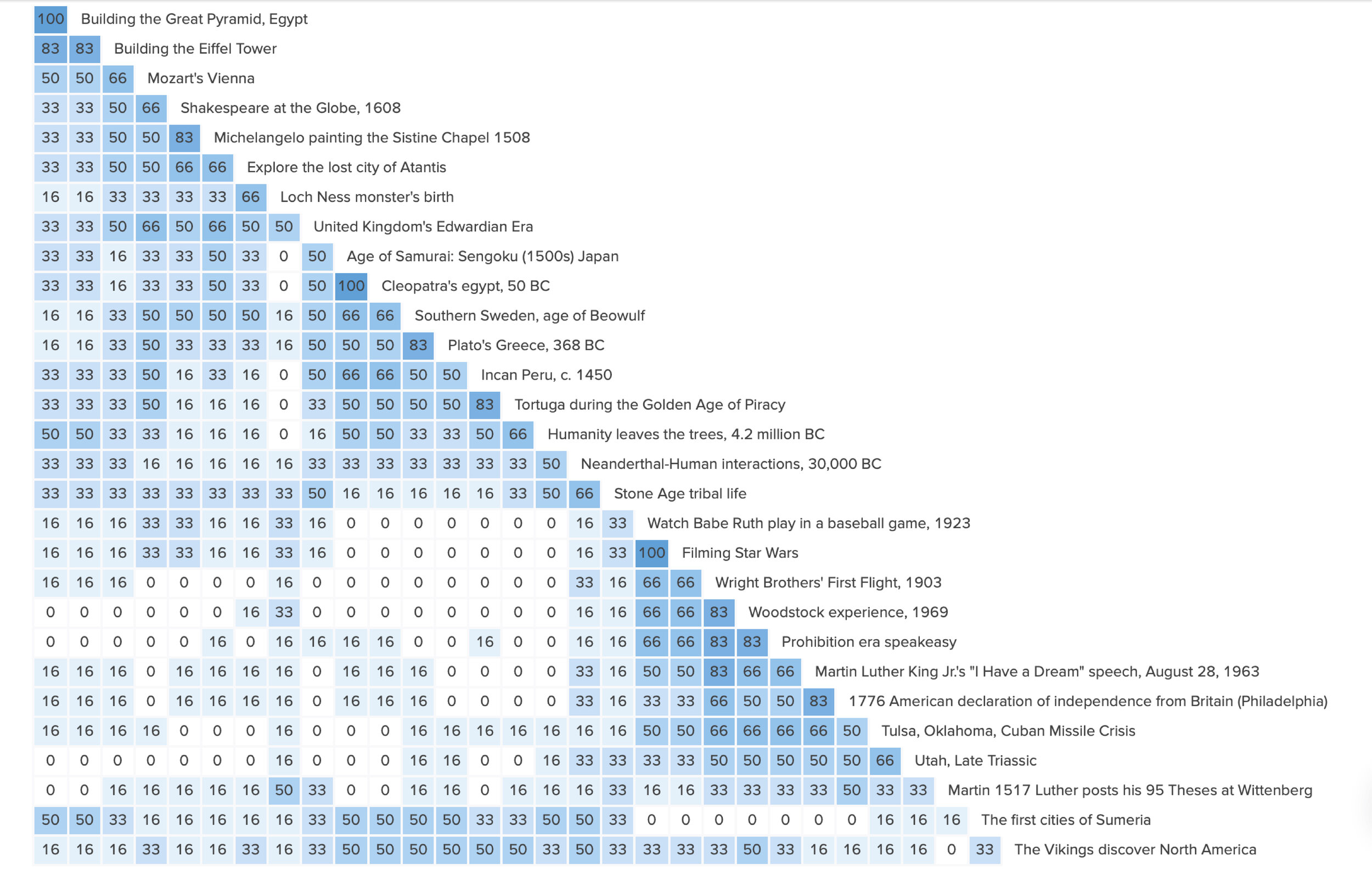
Card Sorting
I had 6 participants for my sort on OptimalWorkshop.com. Two of those participants organized cards geographically while the others did both geographically and by theme. I found to meet user’s needs I must filter by location, event, year & price.

Sitemap
After analyzing my data from the card sort I was able to layout the site. From the home page I knew I had to have the option to book a trip, packages ready for purchase, about, search & a profile. My main focus was the goal: easy checkout with user in mind.

Sketches
I began with a simple flat site that the images would really be the focus. Then I thought of telling a story of uncovering the past for the user. I wanted the user to imagine how they would feel by choosing BE... whatever experience that was available.
Interaction Design
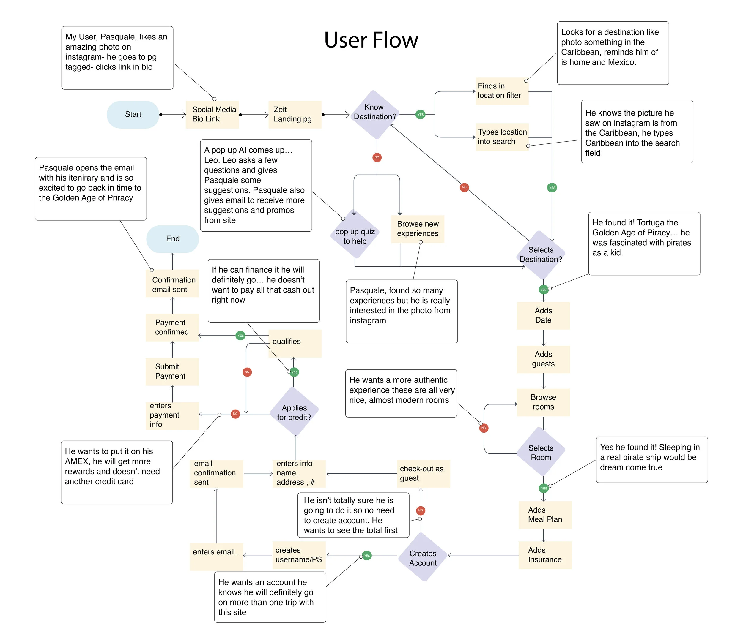
User Flow
I created a user flow for my persona, Pasquale. Creating this flow allowed me to really think like my user. The user’s thoughts & feelings guide their decisions. I tried to created different paths the user could take without the user fighting their thoughts or emotions that would ultimately lead them to the checkout page.

Wireframes
For this case study my main focus was the checkout process. The landing page is interactive with the hero image correlating with the text “Be… a pirate”. The call CTA under the text leads the user right to a “pirate package”. Other frames are categories, product details and about page.

UI Design
Branding


The logo represents the bending of time & a transformative experience for one to “be” who they want and when in any point in time.
UI Kit

UI Site

My initial research findings through competitive analysis lead me to design a sleek site with colors associated with space. I also utilized the same UI patterns I found on travel sites & clothing sites to give the user a familiarity within the unknown concept of the site, time travel. I took the direction away from a super “techy” space site and added more humanity into the design with a softer san serif & collage interactions.

Iterations
Usability Testing
Participants: 3
Age: 36-45
Fit Persona: 2/3
To evaluate the checkout & user’s understanding of the landing page on the Be Travel Site, I relied on the usability scores by the Maze app & written user feedback from my 3 usability tests. This allowed me to gain deeper understanding through combining both qualitative and quantitative data. Although users were able to get through the checkout quickly and with ease they did not reach all expected screens. The miss click rate was 33% for the landing page menu top right drop down and a 22 second time spent on landing page.
Objective
Identify any obstacles and or ease of use the user encounters when trying to complete the task of booking & paying for a trip and provide opportunities for improvement.
Goals
Observe how the user interacts with the homepage.
Test how intuitively the user navigates from the homepage to confirmed checkout page.
Observe how users choose a destination.
Note frustration, satisfaction & duration for all.

All of the users completed task to find what the site is about. One user went off the expected path.
2/3 users rated the homepage 4 on a scale 1 confusing to 5 they know where to go. One user rated 3 and stated “the option in the drop down menu could have been displayed more clearly.” - Tester 1
All of the users booked the pirate trip with ease. All users rated the process 7 on a scale 1 very difficult to 7 very easy.
All users confirmed when shown a picture of forms for the dates when booking met their expectations. However 0/3 users clicked on any form (guest # or selected dates) when booking their trip.
When asked if frustration occurred during navigation 2/3 stated no. One user felt frustrated with the drop down option on the landing page.
When asked if there were any interactions or satisfying moments on site 2/3 users stated the visuals were pleasing. “The visuals are pretty and not too overwhelming” - Tester 2. “yes it was very visually pleasing, i liked all the pictures” - Tester 1
Affinity Map
I created the affinity map to really gauge where my users were going and how they ended up where they did on the site. Through the maze app I was able to see how my users interacted with each screen & for how long (I wish maze had the camera on to see user’s face or be present for this usability test) . After evaluating my data I had a solid idea of areas within my site that worked, I thought would totally work and didn’t and improvement I needed to implement.

Participants (3) Age 36-45
Interested in travel & book all travel online
Wins
CTA on landing page
Visually pleasing
Checkout flow easy & understood
Improvements
Replace Be drop down with slide show
Add book trip to every page
Require all fields filled for forms
Increase hit spots for hamburger
Replace Be drop down with slide show
Next Steps
Omit the drop down option for Be _. Keep original concept and implement a slide show with Be experience & the experience will correlate with picture.
Top right hamburger menu increase hit spot and also with the drop down options for that menu.
Add book a trip to every page
Before Usability Test

Users found the drop down option on the landing page confusing. It was intended for the user to select and explore different experiences from drop down that would change the hero image.
After Usability Test

I kept the same concept and deleted the drop down option. Instead I created a few hero images that changed when hovering & the CTA for each image lead the user to a product page that correlated with the image and also other offerings similar to the original hero image.

Reviewing my heat maps from the test I noticed most of my participants going to the hamburger menu or header to book a trip but not utilizing the search? I decided to add a booking option to my header so it is accessible on every page. The small booking tab slides in when book is clicked. I know this is an unusual booking interaction & I am not sure if it would be complicated for the developers. This was an interesting way for me to solve the problem & look forward to how or if users will find this an easier path to checkout.
Conclusion
The concept was strange, right? Time travel. When I did my initial research for my personas each person had a deep motivation as to why they travel… to be something! Whether is was to be more relaxed or thrilled it was something they were not experiencing in their everyday lives or maybe gave themselves permission to “be” on vacation. I decided to commit to my original concept and it didn’t go according to my plan.
Challenges
Participants for usability test were not able to meet via zoom or in person
Some participants did not take the test on the timeline we disscussed or started the test at work and had to bail because they got busy
Users weren’t really understanding the landing page interaction (The main concept for the site)
Overcoming
Participants were unable to meet via zoom so I searched for an online tool and found the Maze app for testing
I carefully went through all of my data and contacted users to see the reasons for not finishing or staying so long on screen. I found out it was bad data and deleted
I was committed to figuring out a way to make the concept understandable through design without compromising the users’ needs & wants. Also totally accepted the possibility that I might have to go in a completely different direction to attend to the user and accomplish my stakeholder’s main goal.
Thanks for scrolling.